


.png)


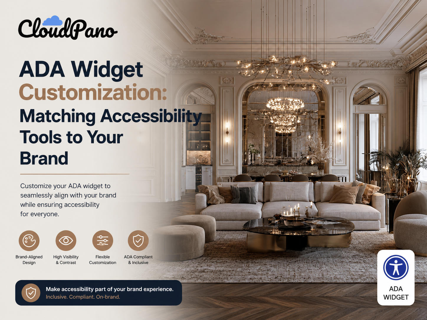
One common concern business owners raise when adding accessibility tools to a virtual tour is visual: "Will this clash with my brand?" It's a fair question. Early accessibility overlays earned a reputation for looking bolted on and generic. The good news is that modern tools let you customize your ADA widget so it fits naturally into your tour's design without sacrificing the functionality that makes it useful in the first place.
An ADA widget only helps visitors if they can actually find and use it. A widget that clashes with your brand, sits in an awkward position, or looks so generic that visitors don't recognize it as a useful feature may go unused — even if it's technically fully functional.
At the same time, over-customizing a widget to the point where it blends in completely can defeat its purpose. There's a balance: the widget should feel like a natural part of your tour's design while still being clearly visible and recognizable as an accessibility tool.
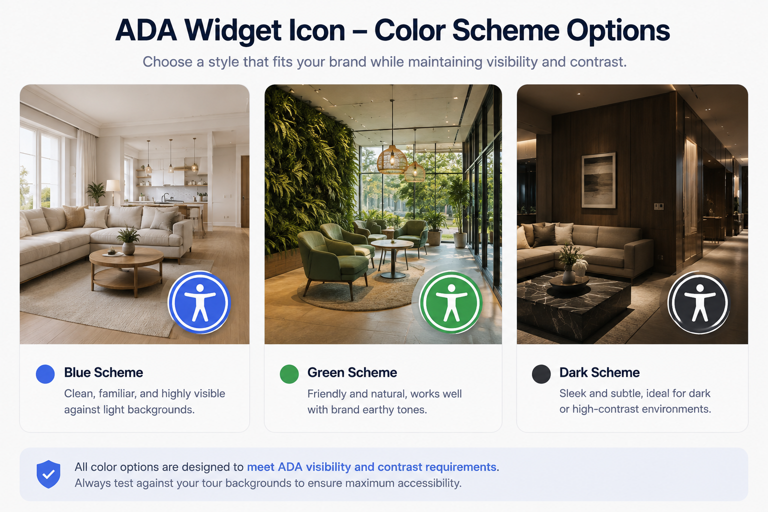
Most modern ADA widgets, including CloudPano's, allow adjustments across several areas:
Icon color and style. You can usually match the widget icon to your brand's color palette, as long as it maintains sufficient contrast against your tour's background to remain visible — a requirement rooted in the same WCAG contrast guidelines that govern the rest of accessible design.
Position on screen. Common placements include the bottom-right, bottom-left, or a fixed position along one edge of the tour viewer. The right choice often depends on where your other UI elements — such as navigation controls, branding, and hotspots — are concentrated.
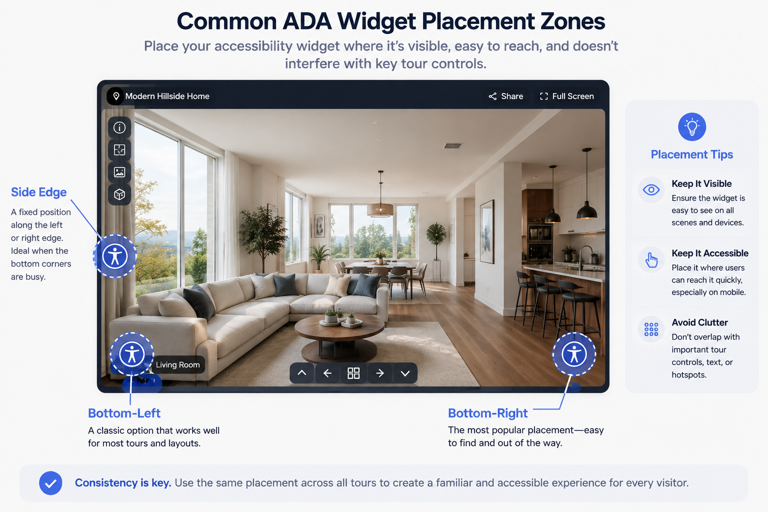
Size. Larger icons are easier to notice and tap on mobile devices but can feel visually heavy in a minimalist design. Smaller icons blend in more naturally but risk being overlooked or becoming difficult to tap accurately.
Menu styling. Once activated, the widget typically opens a small menu with accessibility options, such as text size, contrast, and navigation assistance. Many platforms let you adjust the visual style of this panel — including fonts, colors, and corner rounding — to better match your broader design system.
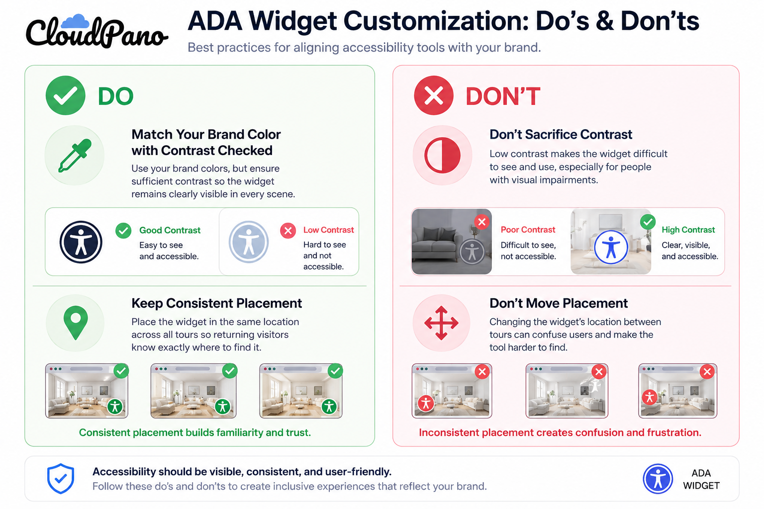
While there's real flexibility in appearance, a few things should remain non-negotiable regardless of your branding preferences:
Contrast and visibility. However you style the widget, it needs to remain clearly visible against your tour's background in every scene, not just the ones you've tested.
Consistent placement. Moving the widget's location between different tours or pages can create confusion for repeat visitors who have learned where to find it.
Functional labeling. Even if you restyle the visual menu, the underlying labels and announcements that screen readers rely on shouldn't be altered in ways that make them less clear or useful.
Start with your brand's primary or secondary color as the base for the widget icon, then check its contrast against your tour's typical scene backgrounds. Real estate interiors tend to be lighter, while industrial spaces may be darker, so test the widget across a representative sample rather than relying on a single scene.
From there, adjust its position based on where your existing tour controls are concentrated, keeping the widget in a consistent, uncluttered corner. Finally, review the expanded menu styling to make sure the fonts and colors feel consistent with the rest of your site without changing anything that affects readability or contrast.
Any time you adjust a widget's appearance, it's worth re-testing its basic functionality — particularly contrast and mobile visibility. A color combination that looks fine on a designer's monitor may fail contrast requirements or become difficult to see on certain devices or in bright outdoor lighting. This is particularly important for outdoor property tours or other experiences that may be viewed in varying environments.
A well-branded, clearly visible ADA widget signals something important to visitors: accessibility was considered intentionally rather than added as an afterthought. That impression matters — both for visitors who rely on the widget directly and for the broader perception of your business as detail-oriented and inclusive.
To see how customization works within CloudPano specifically, visit the ADA compliance page, or explore CloudPano's full feature set to understand how branding and accessibility fit together across the platform.


Compact, ready to go anywhere
Interchangeable lens that’s upgradeable
Dual 1-inch sensors for improved clarity and low light performance
Dynamic range and 6K 360° capture
360° photo resolution at 21MP

8K 360° video recording for ultra-detailed visuals.
4K single-lens mode for traditional wide-angle shots.
Invisible selfie stick effect for drone-like perspectives.
2.5-inch touchscreen with Gorilla Glass protection.
Waterproof up to 33ft for underwater shooting.

360° photo resolution in 23MP
Slim design at 24 mm thick
Built-in image stabilization for smooth video capture.
Internal 19GB storage for photo and video storage.
Wireless connectivity for remote control and sharing.

60MP 360° still images for high-resolution photography.
5.7K 360° video recording at 30fps.
2.25-inch touchscreen for intuitive control.
USB Type-C port for fast charging and data transfer.
MicroSD card slot for expandable storage.
.png)

.png)

Try it free. No credit card required. Instant set-up.







.svg)


.svg)