


.png)



It's a reasonable thing to be skeptical about: does a 3D walkthrough actually help sell more, or is it just a nice-looking feature that doesn't move the needle? The honest answer is that virtual tour software for retail can meaningfully affect conversion, but only when it addresses a specific kind of uncertainty that stops online shoppers from buying — not simply because 3D content is inherently more persuasive than photos.
Online shoppers hesitate for identifiable reasons: uncertainty about scale and proportion, uncertainty about how a space or product actually looks from angles a static photo doesn't show, and uncertainty about whether the in-person experience will match what's presented online. A well-built retail 3D walkthrough directly addresses these specific uncertainties by letting a shopper explore a space or product display the way they would in person, rather than piecing together an impression from a handful of curated photos.
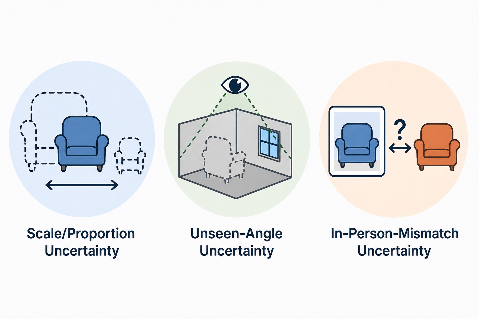
This matters because conversion lift, where it happens, comes from resolving specific doubts a shopper had — not from novelty. A walkthrough that's technically impressive but doesn't actually answer "what does this look like from where I'd be standing" or "how big is this space really" isn't addressing the uncertainty that actually blocks a purchase decision.
Placement matters as much as execution quality. A walkthrough buried on a secondary page that shoppers rarely visit won't resolve much uncertainty regardless of how well it's built, since it never actually reaches the moment of hesitation it's meant to address. Positioning it directly on the product or store page, ideally near the point where a shopper would naturally be weighing scale, layout, or detail concerns, gives it the best chance to actually influence the decision rather than existing as a disconnected feature a shopper has to go looking for.
This is worth testing alongside the conversion measurement described later in this article — the same walkthrough content can perform very differently depending on where and how prominently it's surfaced in the actual shopping flow.
An ecommerce virtual store works best when it's built around the specific questions a shopper has at the exact point they're hesitating, rather than as a general showcase. For a physical retail space being represented online, this might mean letting a shopper walk through and see product placement and store layout directly. For product-focused retail, it might mean a walkthrough that lets someone examine an item from angles a flat product photo can't provide.
The common thread: the walkthrough should be doing real informational work — resolving a specific doubt — not just existing as a modern-feeling addition to a product page.
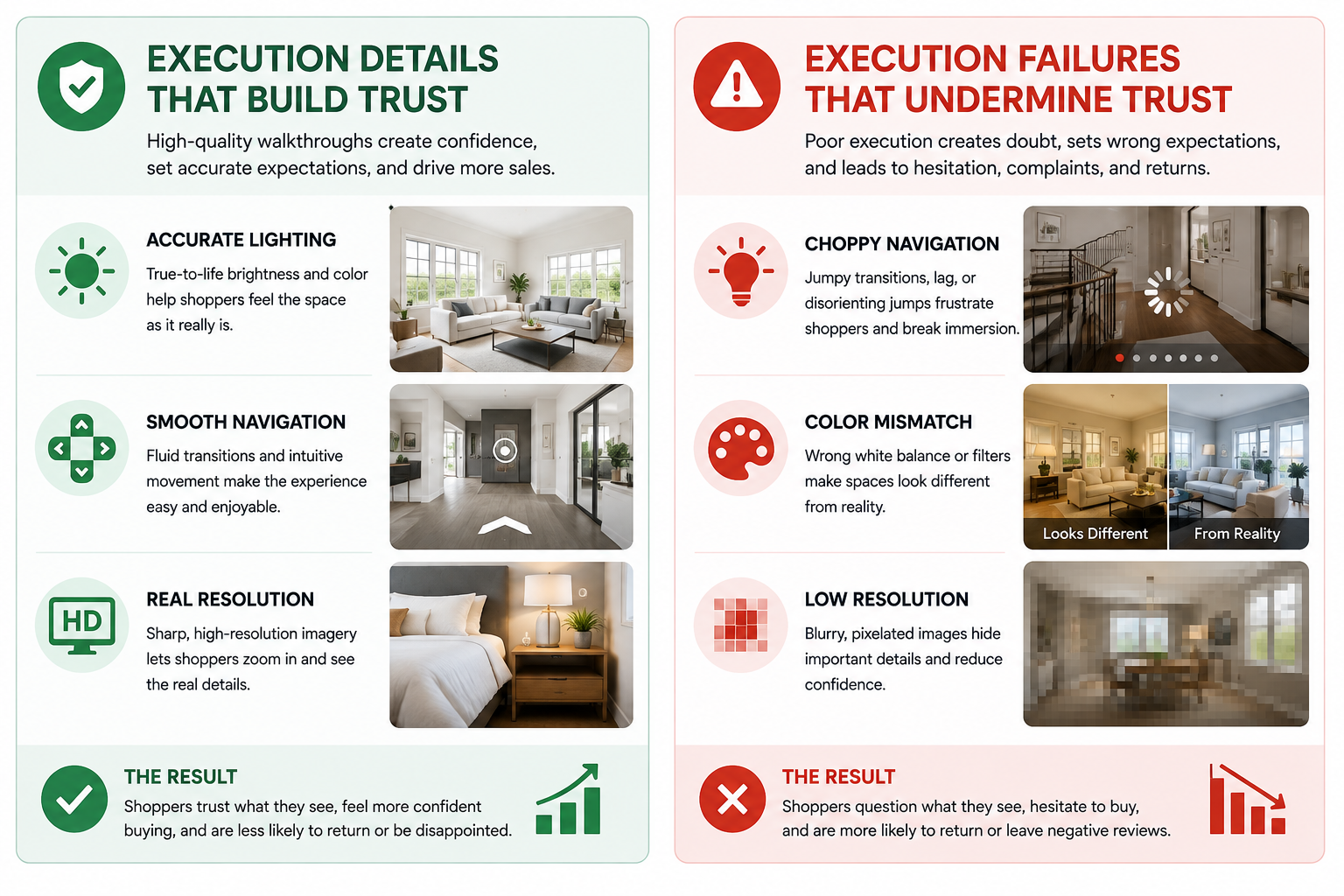
A genuine 360 shopping experience succeeds when it closes the gap between browsing online and being physically present, specifically at the moments where that gap creates hesitation. This means paying attention to details that a rushed implementation might skip: accurate lighting that matches the real space or product, smooth navigation that doesn't feel disorienting, and enough resolution that a shopper can actually examine detail rather than getting a blurry approximation.
A poorly executed version of this — choppy navigation, inaccurate colors, low resolution — can actually undermine trust rather than build it, since it creates a mismatch between the online representation and reality that a shopper might reasonably worry extends to the product or space itself.
Conversion isn't the only metric worth tracking when you test a retail 3d walkthrough — return rate is often just as informative, and sometimes more so. If a walkthrough is genuinely resolving the uncertainties described above, you'd expect not just more purchases but fewer returns, since customers who bought after seeing an accurate representation of scale and detail are less likely to be surprised by what actually arrives. A walkthrough that boosts conversion but doesn't reduce returns is worth investigating further — it may be driving purchases through appeal rather than through genuine uncertainty reduction, which is a less durable effect over time.
Tracking both metrics together gives you a more complete, more honest picture of whether a retail 3d walkthrough is doing the specific job described throughout this article, rather than looking at conversion alone and potentially missing a hidden cost on the returns side.
The honest, credible position here is that a well-built walkthrough plausibly reduces the specific uncertainties described above, based on how e-commerce purchase hesitation generally works — but the actual size of any conversion effect depends heavily on your specific product, store, and audience, and should be measured directly rather than assumed from a general industry claim. Running a walkthrough on a subset of your catalog or store pages and comparing conversion against a control group without one is the only way to know your actual number, rather than relying on someone else's general claim about the category.
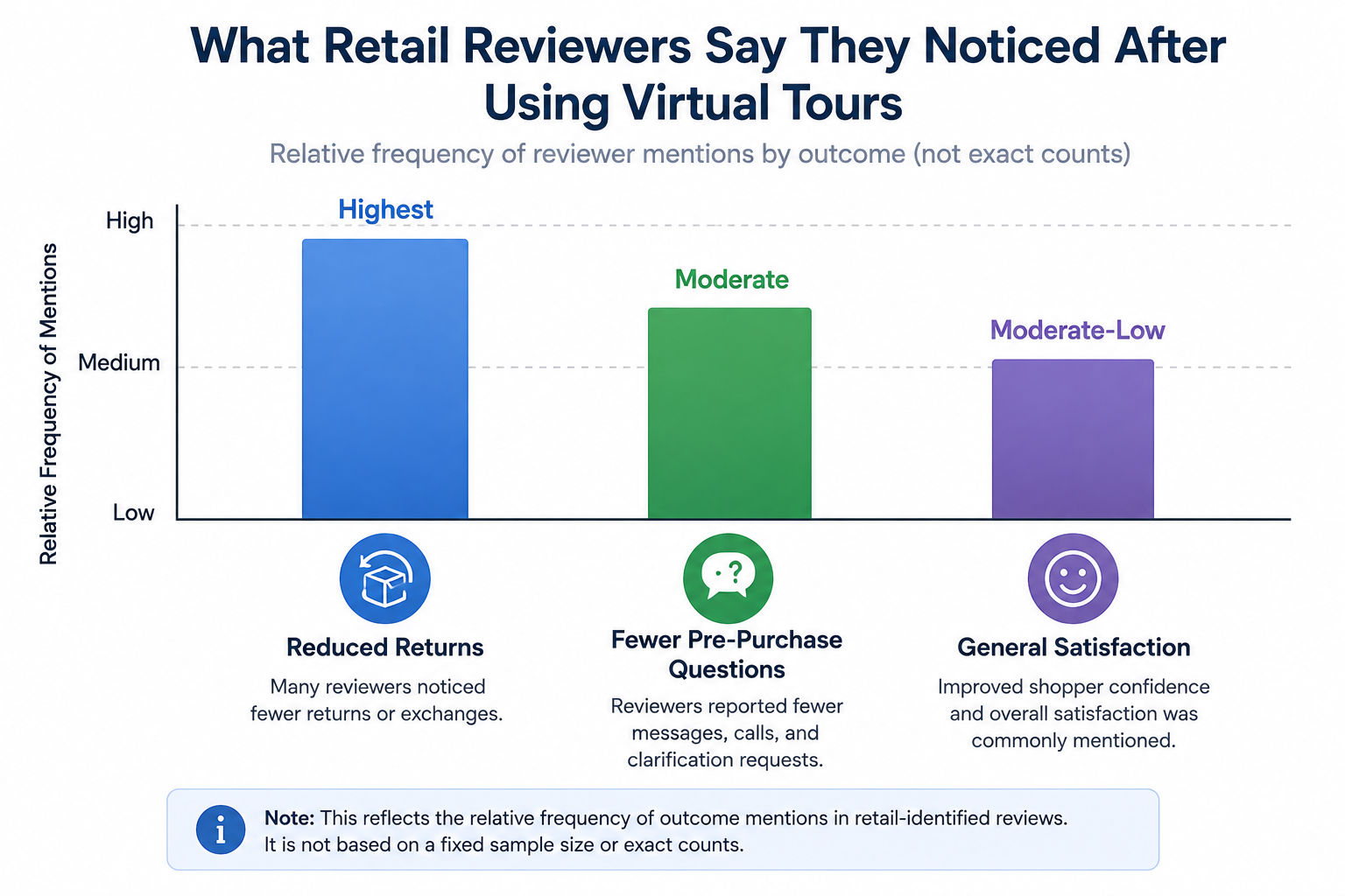
On G2's virtual tour software category page, retail-identified reviewers frequently mention reduced return rates or fewer pre-purchase questions as the outcome they noticed most, which is a useful, if informal, signal that walkthroughs are addressing genuine information gaps rather than functioning as decoration.
Retail and e-commerce trade publications occasionally cover virtual and augmented shopping experiences in the context of broader digital retail strategy, which can be a useful supplementary read for understanding how this fits into a wider e-commerce toolkit beyond the walkthrough itself.
A meaningful share of retail browsing and purchasing now happens on mobile devices, and it's worth confirming a walkthrough performs well in that specific context rather than only testing it on desktop. A walkthrough that requires precise mouse control or loads slowly on a phone connection can undermine the exact trust-building effect it's meant to create, regardless of how well it performs on a desktop demo. Testing on real mobile devices, under realistic connection conditions, is worth doing before drawing conclusions from your pilot.
"Isn't this just a flashy feature that shoppers ignore?"
That's a fair concern for a poorly targeted implementation — a walkthrough bolted onto a product page without addressing any specific shopper uncertainty probably will get ignored. The distinction that matters is whether the walkthrough is actually resolving a doubt a shopper has, which is why the framing throughout this article emphasizes specific uncertainty reduction rather than generic "3D is engaging" reasoning.
"How do I know if my specific products or store even benefit from this?"
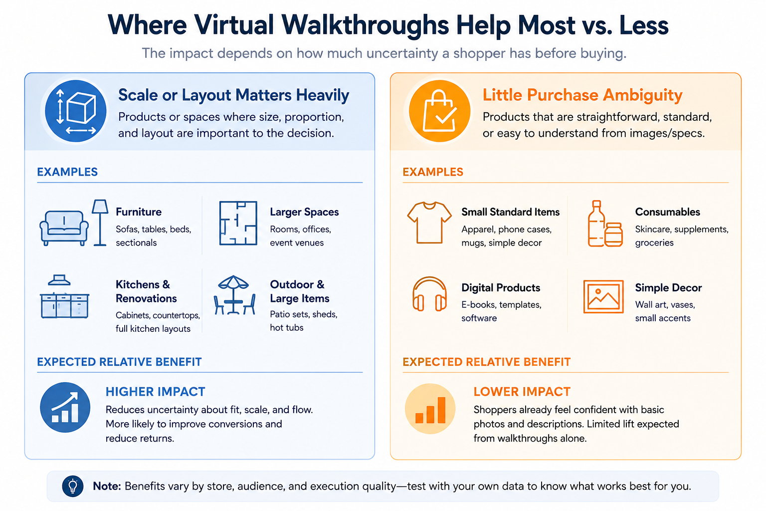
Products or spaces where scale, spatial layout, or fine detail matter to a purchase decision tend to benefit most — furniture, larger items, or any physical retail space where layout affects the shopping experience. Simple, well-understood products with little ambiguity about what you're getting may see less benefit, and it's worth being honest about that rather than assuming universal lift.
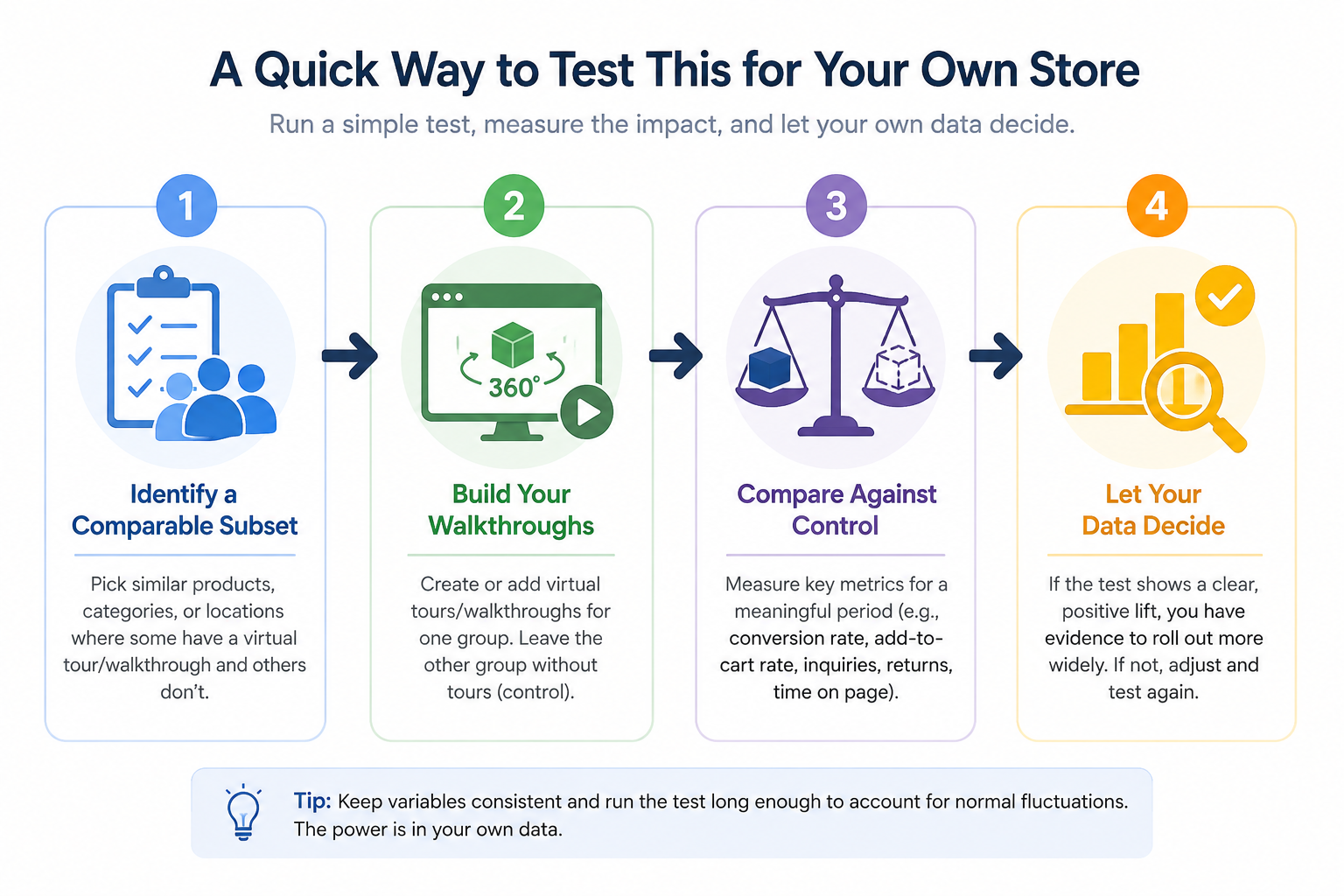
A 3D walkthrough can genuinely boost retail conversion, but the mechanism matters: it works by resolving specific purchase uncertainties around scale, layout, and detail, not through novelty alone. The honest path forward is testing this directly against your own products and audience rather than assuming a general lift, since the actual effect size depends heavily on what you're selling and who's buying.
If you want to test this approach with your own catalog or store, a CloudPano trial lets you build a small pilot walkthrough and measure the effect directly. And if you want the broader industry-by-industry framework this article builds on, our guide on choosing virtual tour software by industry covers that ground in full. Whatever you find in your own testing, treating the walkthrough as a hypothesis to validate rather than a guaranteed win is the approach most likely to give you an honest, useful answer for your specific business.


Compact, ready to go anywhere
Interchangeable lens that’s upgradeable
Dual 1-inch sensors for improved clarity and low light performance
Dynamic range and 6K 360° capture
360° photo resolution at 21MP

8K 360° video recording for ultra-detailed visuals.
4K single-lens mode for traditional wide-angle shots.
Invisible selfie stick effect for drone-like perspectives.
2.5-inch touchscreen with Gorilla Glass protection.
Waterproof up to 33ft for underwater shooting.

360° photo resolution in 23MP
Slim design at 24 mm thick
Built-in image stabilization for smooth video capture.
Internal 19GB storage for photo and video storage.
Wireless connectivity for remote control and sharing.

60MP 360° still images for high-resolution photography.
5.7K 360° video recording at 30fps.
2.25-inch touchscreen for intuitive control.
USB Type-C port for fast charging and data transfer.
MicroSD card slot for expandable storage.
.png)

.png)

Try it free. No credit card required. Instant set-up.




.svg)


.svg)